
Educators are most familiar with descriptive statistics: the ways we describe a set of data. What is the shape of the distribution of values? Where is the "middle"? What can we say about the population of values and their relationship to one another?
I have pulled a new data set to play with...one with test scores for about 500 students. While you can do statistical analysis with your gradebook---and let's face it, most teachers do in terms of how they assign final grades for students---I am a little squeamish about doing so. There may be no magic number that applies to every sample size, but I want us to play with something we can have a little more confidence in than the basic gradebook I've posted here. You can download the test scores workbook here.
This is the basic set up:

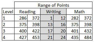
I have divided the data set into two schools: A and B. Each student is identified by their first name, and in some cases, a last initial. There is a raw score for reading, writing, and math, as well as a level of performance (1, 2, 3, 4). The range of score points for each level plays out like this:
You may look at this and wonder about what appears to be missing points (Why can't anyone get a 399 on the reading or math test?!) and why writing has a different scale. There are reasons...good ones...but I'm not going to get into them at the moment. These data do come from (old) state test results: first names of students are unchanged, but I did fill in some missing scores. We're going to play along with the rules that were originally applied to determine the scores. So, do your best to overlook the oddities of these scales for now. For these tests, a score in Level 3 would mean a student can meet the standard (Level 4 = exceeds, Levels 1 and 2 = below standard).
Let's start with measures of central tendency (mean, median, and mode) for our reading data (C2: C517). For the mean, Excel uses the AVERAGE function...for median, oddly enough, we can use MEDIAN...and for the mode, it depends on which version of Excel you have. In olden versions, the MODE function worked just fine, but starting with 2010, you have choices. To just get "the" mode, use the MODE.SINGL function. To get multiple modes from an array of data, you can use the MODE.MULT function---a very handy improvement. Not every data set is bell-shaped. So, here is what we have for the reading scores. I placed the formulas in the table on the right so you can see the syntax.

If you want to graph this data set, it's not so friendly in its current form. We'd be better off building a frequency table first. This will allow us to find out how many students are in each category, then create a graph to visualize the distribution. To keep things simple, let's find out how many students scored in each level for the reading test. Build a simple table first, then select the empty cells:

Now you're ready to add your formula---a single formula ("array formula") which will fill all the cells at once. Then belly on up to the formula bar (too bad you can't pull a beer from here) and start entering the formula:


When you've finished entering this information, you need to use a command to fill in all of the cells in the table. Plain old ENTER will not work. You have to use CONTROL + SHIFT + ENTER. And poof! We now have a frequency table:

If this scares you, you can use a simple COUNT function in each cell, but hey, you're ready to use big kid functions. Give FREQUENCY a try. Use the filters in Excel and compare School A with School B.
This is a good spot to stop for today, but we'll come back to this data set another day to see other descriptive statistics in Excel...and then move on to inferential analysis.
Bonus Round
Did you know that Excel has a whole category of statistics functions? Get in there and play!

No comments:
Post a Comment